
Optimizing spend management for cloud services by streamlining reporting tools and maximizing savings
Internship • 7 min read
Company
My role
Overview
Timeline
Tools
Before we start
What is

6 months • 8 projects
What did I work on?
5 reporting tools

2 new features

Exchange and return hub
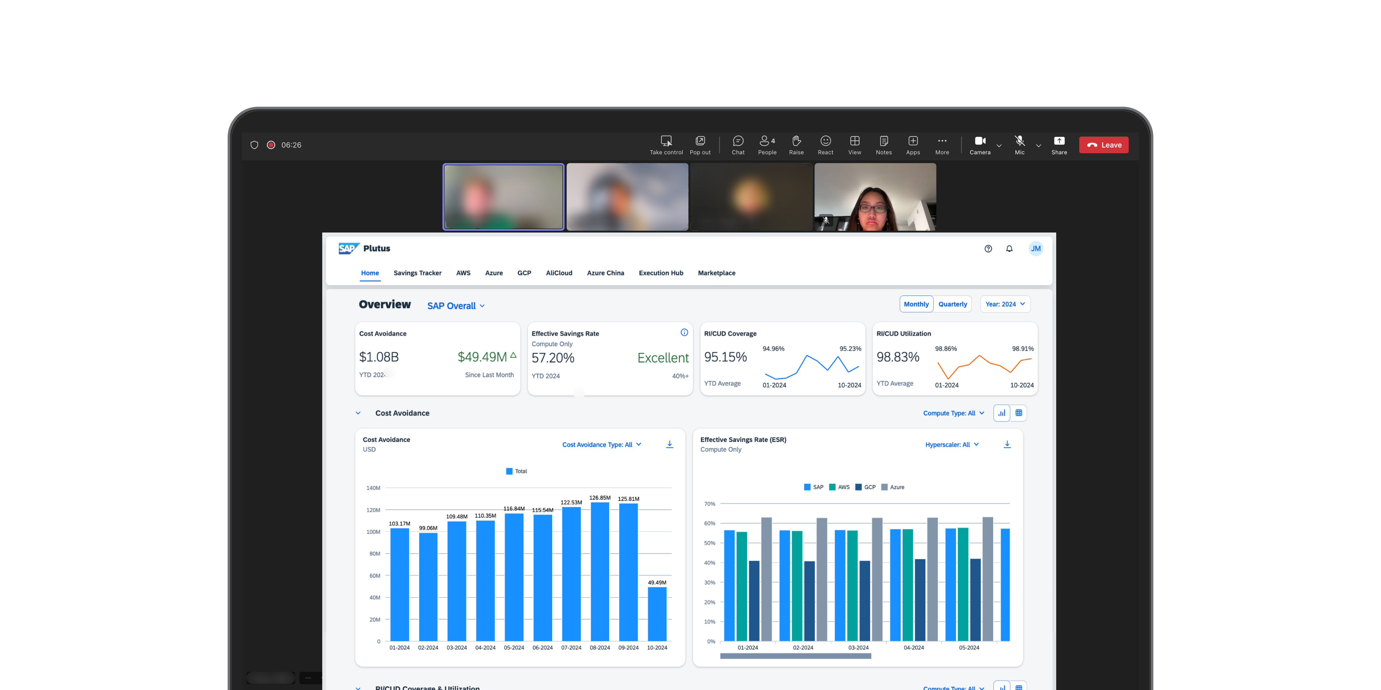
Project highlight: Plutus dashboard redesign
👋🏻 Quick reminder
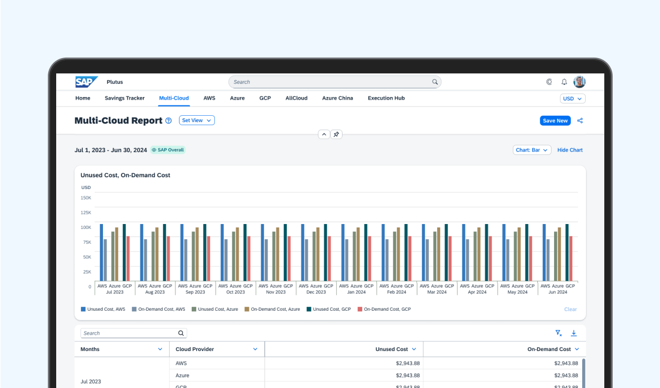
Plutus is an internal spend management platform for cloud services used by finance and operations teams to monitor cloud costs and performance.
One project I took ownership of was redesigning a dashboard that many users found frustrating and overwhelming.
😵 First impression: whoa.
The dashboard contained a large amount of cloud spending data, but users struggled to quickly understand what mattered.
It tried to show everything at once. Charts stacked vertically made it difficult for users to scan information or compare trends across cloud spending metrics. Users constantly had to scroll up and down just to piece together what was happening.
Some of the feedback I heard during research:
• “It felt very overwhelming.”
• “I have to scroll up and down multiple times to look at all data.”
• “I can’t tell if a trend is good or bad.”

And honestly, I felt the same way when I first used it.
As an intern, I was still learning about enterprise spend management tools, but I kept thinking: if I already feel lost trying to read this dashboard, users who rely on it daily are probably struggling too.
So I decided to dig deeper.
🔍 Starting with a heuristic evaluation
Before proposing solutions, I wanted to understand exactly where the experience was breaking down.
I conducted a heuristic evaluation of the dashboard to identify the biggest usability issues. A few patterns quickly stood out:
• Too much information competing for attention
• No clear visual hierarchy
• Charts lacked context
• Hard to compare spending performance against KPIs
• Important insights were buried far down the page

I shared these findings with the PM and UX Design Specialist, and the redesign quickly became a high-priority sprint project, and I was trusted to lead the design work.
That moment meant a lot to me as an intern. It was the first time I felt like my observations directly influenced the product roadmap.
🧭 Figuring out what actually mattered
I wanted to understand how finance teams actually monitored and analyzed cloud spending in their day-to-day work.
To gain insights into how they actually used the dashboard, or why they didn’t, I:
• Interviewed finance leaders and LoB managers
• Studied dashboard design patterns
• Reviewed data visualization best practices
• Looked at how teams monitored cloud spending KPIs
• Explored what financial insights users cared about most
Everyone had a different job title, but nearly all of them were trying to answer the same questions: Are our expenses going up or down? Who’s spending the most? And is that expected or a problem?
One thing became very clear: Users did not need more charts. They needed clearer structure and better prioritization of information.
🧹 Cleaning it up
The redesign focused on helping users quickly evaluate cloud spending performance while still supporting deeper analysis.
I redesigned the experience around two main goals:
1. Help users understand spending performance at a glance
2. Make deeper analysis easier when needed
Instead of one long page of charts, I reorganized the dashboard into clearer sections with stronger hierarchy and more intentional layouts by using two distinct views.
The first was a leaderboard view that gave teams a quick snapshot for users to compare spending performance against KPIs without digging through detailed reports — kind of like a scoreboard for cost visibility.

The second was a chart view, designed for deeper analysis. It showed how spending was trending over time and helped users break down costs by different variables.

🫣 The tricky bits
There was a point mid-project where I kept trying to add just one more thing.
Adding one more chart, one more toggle, one more data breakdown. It felt like more would mean better. But then one user told me:
That snapped me out of it. From then on, every design decision was about: What helps people get answers faster? What can I take away so the important stuff stands out?
You don’t need to show everything; just make sure the right things are easy to find.
🧪 What changed?
The redesigned dashboard made cloud spending insights easier to scan, compare, and act on.
I tested the new dashboard with 8 users across finance and operations. Most of them found the insight they were looking for (e.g., evaluating important spending metrics at a glance, understanding performance trends over time) in under a minute.
Looking back, the biggest issue was how the cluttered experience made users feel less confident interpreting the information in front of them. When trends were difficult to read and important insights were buried, users hesitated to fully trust the data or make quick decisions from it.
By creating clearer hierarchy, easier comparisons, and more digestible visualizations through the redesign, users were able to trust the data more easily and make faster, more informed decisions.

✅ Did It work?
The redesign didn’t just look better, it helped people work better.
After launch, I checked in with the same group of users, plus a few new ones. This version didn’t just feel easier, it was measurably more effective.
People were finding answers faster. Tasks that used to take around five minutes, like spotting a cost spike or identifying a top spender, were now taking less than a minute. In post-launch interviews, most users said they felt more confident using the dashboard and no longer needed to manually analyze scattered reports.
The dashboard became reliable.


Internship experience
Designing, learning, and growing with Plutus 🌟

